The builder
The Report
What the run measured, against the limits you set, with charts and a verdict. The one artifact whose numbers come only from hardware.
The Report is a document you can hand to a customer or file in a design history file, generated from the rows a run actually wrote. It has its own pane and is never folded into Plans, because the two answer different questions.
What is in it



| Part | Contents | Who wrote it |
|---|---|---|
| Title and subtitle | Editable in place. | Agent or you |
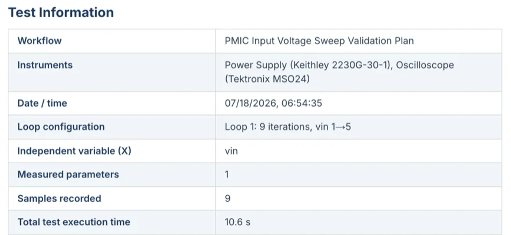
| Test information | Instruments used with models and addresses, set-points, loop summary, execution time, timestamp. | The run |
| Groups | One section per workflow step, holding the columns that step measured. | Agent |
| Columns | The measured data, with a display label, an engineering unit, and an acceptance limit. | Structure by the agent, values by the run |
| Charts | Line, scatter, bar, or histogram, with the limit band drawn behind the series. | Agent |
| Verdict | Overall pass or fail, derived from the limits actually evaluated. | The run |
| Notes | Prose about the test. Never about its results. | Agent or you |
The rule that makes it trustworthy
The agent authors structure. It never authors values.

There is deliberately no field in a report capable of holding a measurement. Not “measured”, not “result”, not “actual”, not a free-text cell. The agent can ask for load current with a band of 1.9 to 2.1 A. It is structurally incapable of claiming the load current was 2.03 A, because there is nowhere to put that claim. Values arrive from exactly one place: the run's results file.
This also means the Report needs a run. Before one exists, asking for a report gets you an honest answer and an offer to run the test, not a document with plausible numbers in it.
Choosing the charts
Chart choice follows from what a column means, which is why the agent is told the semantics rather than just a list of names.
| The data | The chart | Why |
|---|---|---|
| A swept loop variable on X | Line, with the limit band behind it | The shape of the curve against the spec is the whole answer. |
| Repeated readings at one set-point | Run chart or histogram | You are looking at spread, not at a trend. |
| Per-iteration verdicts | Pass/fail strip | Where in the sweep it failed matters more than how much. |
| Categorical comparison | Bar | Corners, units, or channels side by side. |
Group the report by test step, put VIN on the x axis, show the VOUT limit band, and add a histogram of the ripple readings.
Editing it
Headings, subtitles, notes, group headings, group instruments, and column units are all editable in place. Click and type. The numbers are not editable, by design.
Exports
| Format | What you get | Use it for |
|---|---|---|
| Word (.docx) | The full report with its charts, as a Word document. | A customer deliverable, a design history file, anything a reviewer will redline. |
| Results (.xlsx) | The measurements as a spreadsheet, with units, limits, and the readings that fell outside them. | Analysis, and handing data to someone who lives in Excel. |
| Run data (.json) | The run’s outcome, bench, and limits as structured JSON. | Feeding a dashboard or a data pipeline. |
| Markdown (.md) | The report as text. | Pasting into a ticket, a wiki, or another tool. |
| Copy | The same Markdown, straight to the clipboard. | The fastest path into a Slack message. |